the making of the „bizzy lizzies“ the HmH way / HmH sagt: so gehts
Es gibt die Bilder, in denen ich mich mit Haut und Haar einem Foto als Grundlage ausliefere, damit hat ja alles angefangen, und dann neben vielen anderen Varianten die spezifische HmH Methode.
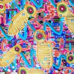
Das Bild, das über diesem Beitrag thront, ist das Ergebnis eines Gestaltungsprozesses, der zunächst fast mechanistisch wirkt, sich aber Schritt für Schritt auf ein differenziertes Ende hin entwickelt. Dabei werden die Gestaltungsentscheidungen bei jedem weiteren Schritt zunehmend von einer ästhetischen Perspektive übernommen.
Als Basisbild fotografiere man z.B. eine Fläche mit einer interessanten Struktur. Ich war auf nichts Besonderes eingestellt, ging es mir doch allein um die nachvollziehbare Darstellung eines Prozesses.
 Also nahm ich das, was mir in dem Raum, in dem ich war, einigermaßen diese Anforderung erfüllte. Mein Regal mit CDs.
Das Bild (wir befinden uns jetzt erst einmal auf der display Ebene des Handys, enthält eine waagerechte Struktur, die Regalbretter, und eine vertikale Struktur, die CDs. Hier steckt schon der erste große Vorteil dieser Herangehensweise. Niemand muss mit einem weißen Blatt anfangen.
Um diese Vorlage zu meinem eigenen Bild zu machen, breche ich erst einmal diese vorhandenen Strukturen auf, indem ich sie durchkreuze mit farbigen Linien, wie ich sie in dem Malprogranmm meines Handys vorfinde.

ich nehme noch eine dritte Farbe hinzu um noch mehr von dem Bild zu erobernn. Noch ist die Struktur aber vorhanden. Ich übermale jetzt das Bild mit beliebigen Kreisformen in einer vierten Farbe. Jetzt ist das Foto weitgehend überdeckt, aber es gibt diese kleinen Lücken durch die die CDs noch durchlugen
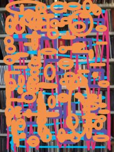 Um ihnen die dingliche Eigenheit zu nehmen entferne ich jegliche information über ihr CD Sein, indem ich die sichtbaren CDRücken durch einen Strich übermale,
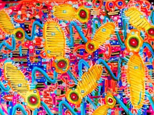
 Nun mache ich einen Ausdruck von diesem Zwischenstand auf glänzendes Fotopapier mit Hilfe meines Druckers. Ich nehme den Druck mit zum Maltisch und beginne einen weiteren Prozeß, der jetzt nicht mehr gegen eine vorgefundene Struktur sich wendet, sondern auf den Vorgaben aufbauend eine neue Strukturierung anstrebt. Um eine Struktur zu erzeugen brauche ich Wiederholungen. Gleiches wird jetzt gleich bearbeitet. Ich erhöhe also die Querverweise innerhalb des Bildes.
Zum Beispiel: Ich habe das Bild mit vielen breiten farbigen Strichen übermalt.
 Denen gebe ich einen Ton-in-Ton gehaltenen Mittelstrich und allen körperartigen Formen eine Schraffierung. Die Staffelung von Gleichem nach Größen bringt ein Gefühl von Räumlichkeit ins Bild. Ich füge weitere Elemente hinzu, z.B. Kreise, vorzugsweise an den Stellen im Bild, wo das zufällige Aufeinandertreffen von Linien und Farben irritiert, weil sie „planlos“ entstanden sind
Durch das Übermalen solcher Stellen mit deckender Farbe, erscheinen die Bildelemente bewusst verbunden, durch flächige Ausmalung des Kreises auf den sich ein kleinerer Kreis legt, dem wiederum ein Mittelpunkt gemalt wird, zumal wenn dieser Vorgang auf dem gesamten Bild erfolgt, reduziert man den „Unsinn“ des Anfangs und leitet das Bild hinüber in einen bildimmanenten „Sinnzusammenhang“. (Bild)Sinn entsteht durch Dias Herstellen von Verbindungen oder das Herbeiführen von Ähnlichkeiten. Das heißt nicht, dass wir einen Sinn
 erkennen, den wir in Sprache ausdrücken können, (also Sinn im philosophischen Verständnis als Antwort auf die gern gestellte Frage: „Was will uns der Künstler damit sagen?“), aber wir sehen nicht mehr das alte Bild, verborgen hinter Gekritzel, sondern ein neues Bild in dem das scheinbare Gekritzel der ersten Schritte im zweiten Schritt, dem Prozess der malenden, gestaltenden Aneignung aufgegangen ist.
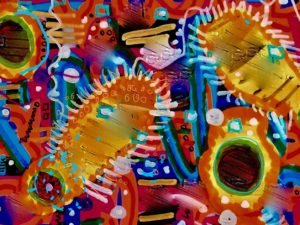
Dieses Bild wird wiederum gescannt und in diesem Fall ein vergrößertes Teilbild aus dem gescannten Gesamtbild ausgedruckt. Jetzt ergeben sich durch das Zoomen neue Möglichkeiten des Hinzufügens von gestaltenden Elementen, weil neue Flächen, neue Räume entstehen. Oder man probiert noch ein paar Farbkorrekturen aus, oder man versucht mit der Retusche Funktion der Fotobearbeitung tuscheartiges Ineinaanderlaufen als Akzent zu nutzen. 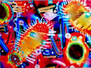 Ich habe schließlich noch die auf dem letzten Bild dunkel wirkenden Kreise mit Goldstaub belegt. Fertig ist ein Bild, das den Ausgangspunkt (das Foto vom CD-Regal) in etwas vollkommen Neues verwandelt hat: wiederum ein BILD. Und dieses Bild wenn du meinem Beispiel gefolgt bist, ist jetzt deins. Von dir gemalt! Was da passiert ist, kann man eine Transformation nennen. Ich nenne deshalb die Art und Weise, ein Bild aus einem anderen Bild entstehen zu lassen – Transformative Malerei.


