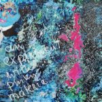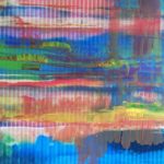
There are the pictures, in which I deliver myself with skin and hair to a photo as a basis, everything started with that, and then, among many other variants, the specific HmH method.
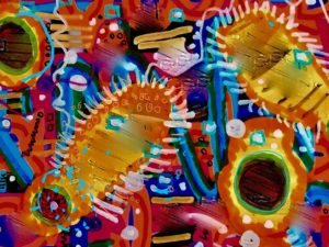
The image enthroned above this contribution is the result of a design process that at first seems almost mechanistic, but gradually develops towards a differentiated end. The design decisions are increasingly adopted from an aesthetic perspective.
 The basis of the picture: one photographs, for example, a surface with an interesting structure. I was not prepared for anything special, as I was only interested in the comprehensible representation of a process.
So I took what I found in the room in which I was, to a certain extent, fulfilled this requirement. My shelf with CDs. The picture (we are now at the display level of the phone, contains a horizontal structure, the shelves, and a vertical structure, the CDs. Here is the big advantage of this approach. You don’t start with a white sheet.
To make this template my own, I first break up these existing structures by crossing them with colored lines as I find them in the painting program of my mobile phone.
I add a third color to get even more power over the picture. But the structure is still there. I now paint over the picture with any circular shapes in a fourth color.
 Now the photo is largely covered, but there are these small gaps through which the CDs were still passing.
In order to take away their material peculiarity, I remove all information about their CD being by painting over the visible CD backs with one stroke,
Now I make a printout of this intermediate result on glossy photo paper with the help of my printer. I take the print with me to the painting table and begin a further process, which now no longer turns against a found structure, but strives for a new structuring based on the specifications. The same thing is now processed in the same way. So I increase the cross-references within the picture. I have painted over the picture a lot with wide coloured strokes.
I give them a tone-in-tone middle line or hatching. The staggering of the same by size brings a feeling of three-dimensionality into the picture. I add further elements, e.g. circles, preferably at the points in the picture where the coincidence of lines and colours irritates.
By overpainting such areas with opaque paint, the picture elements are consciously connected, by painting the circle on the surface of which a smaller circle is laid, which in turn is painted a center, one reduces the “nonsense” of the beginning and leads the picture over into a “sense context”. Meaning is created by the connections or similarities. This does not mean that we recognize a sense that we can express in language, but we no longer see the old picture, hidden behind scribbles, but a new picture in which the scribbling of the first steps in the process of painterly appropriation has merged.
This image is scanned again and in this case printed out as an enlarged partial image from the scanned overall image. Now, zooming opens up new possibilities for adding design elements. Or one tries out a few color corrections, or one tries with the retouching function of the photo processing to use ink-like Ineinaanderlaufen as an accent. Finally, I covered the dark circles in the last picture with gold dust. The result is a picture that has transformed the starting point (the photo from the CD shelf) into something completely new: another picture. And this picture is yours now. Painted by you! What happened there can be called a transformation. That’s why I call the way to let a picture emerge from another picture – transformative painting.


